Action Nodes
When a workflow progresses and reaches an action, data is collected on the client and can be viewed through widgets on the explorations page. These are the supported types of actions:

Record Session
Create a list of sessions by attaching a record session action on any matcher node. This action uploads logs related to the session at the point when the workflow reaches the action and continues to stream logs until the session changes1. Each Record Session rule leads to the display of a table widget in the workflow view, listing all sessions captured under this rule. Using this table, users can navigate to the timeline view, which presents all logged data within that session.

Read the Session Timeline Feature Guide section to learn more about the automatic instrumentation supported.
Plot Chart
A line chart can be created by attaching any number of matching nodes to a single plot series action. Whenever any of the matching nodes that link to a plot series action are hit, a counter is incremented. This counter is then used to generate a time series that can be viewed in the workflow view. For a single plot series action, a corresponding chart widget displays all the matching nodes that link into it as separate time series, labeled by the name of the connection between the matching node and the plot series action.

Multiple charts can be created within one workflow by having multiple plot series actions. Each plot series action can plot multiple series by having multiple matching nodes connected to it.

Tip
Use the date range selector on the top right corner to select a fixed or relative date range. For relative ranges, aggregation periods scale with the lookback range i.e.
- last 15 minutes has a 1-minute aggregation period.
- last hour has a 1-minute aggregation period.
- last 24 hours has a 15-minute aggregation period.
- last 7 days has a 2-hour aggregation period.
- last 30 days has a 2-hour aggregation period.
Enabling Data Segmentation

By default chart and session list data do not collect extra segmentation details such as OS, app version, app ID, etc. By selecting this toggle, extra segmentation details will be collected which currently include: OS, OS version, app version, app ID, foreground status, model, network type, radio type, and locale. This data will be used to power the aggregated insights view. If not selected the aggregated insights view will not be available. Turning on data segmentation will increase the amount of data sent from mobile clients and will lead to high metric cardinality and complexity of the collected data.
Advanced Mode
The Plot Chart action supports advanced data visualization modes. You can plot any numeric field from your log line and use the Group By option to create a separate plot line series for each field value or exposed feature flag.
We support 3 types of data aggregation: Count / Sum, Histogram, and Rate.
 |
 |
Count / Sum
Plots a chart where each data point represents the sum of the numeric value chosen as the Source Field. If * is selected, it will simply count each log occurrence.
By default, a single line is plotted. Selecting the Group By option switches the visualization to instead plot a separate line for each category—now supporting multiple group-by fields, allowing comparisons across several dimensions in one chart (up to 5 combinations).
All plot charts can now also be displayed in a table view, offering an alternate layout for easier data inspection and export.
Additionally, all newly created charts now track the number of unique devices contributing to each data point, as well as the total aggregate, enhancing insight into your user base.

Histogram
Plots a chart where each data point represents a percentile distribution of the numeric value chosen as the Source Field. By default, it computes 3 percentile values (p50, p90, and p99) and plots a separate line series for each. Selecting the Group By option switches the visualization to instead plot a separate line for each category, up to 5 values. You can choose which percentile you want to display in the dropdown.

You can also switch a histogram to a bar chart view to inspect the bucket distribution for a selected series and group-by value. The bar chart shows counts per bucket, includes the bucket range on hover, and surfaces the percentile position within the distribution.

Average
Plots a chart where each data point represents the average of the numeric value chosen as the Source Field.
The visualization and grouping options behave the same as with Count / Sum
Rate
Plots a chart where each data point represents the ratio between two numeric values chosen as the Numerator Field divided by the Denominator Field, expressed as a percentage. Additionally it displays the average percent value, as well as the change delta for the selected time period.

Tip
For charts which have a Group By set to a high cardinality field, such as request path, only the top series will be displayed. You can dig into the data by clicking the 'Customize Dimensions' button above the chart legend.
This allows you search for and select which dimensions to display.
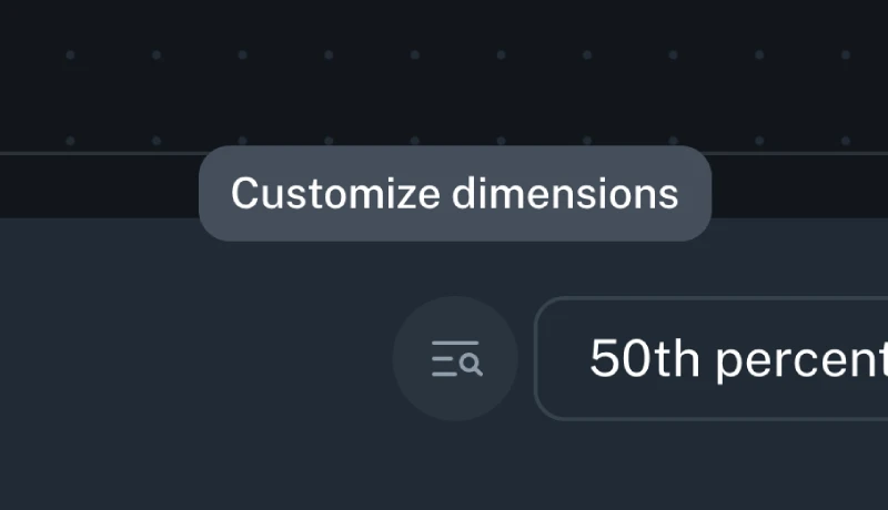
Table View
You can switch from a chart to a tabular representation of the same data by selecting the chart icon > Table view in the top-right corner of a chart.
The table view shows aggregated statistics for the selected time range. The columns shown depend on the chart type and configuration. Aggregation windows influence the calculated values (such as Min and Max).
Table columns by chart type
(Columns shown in square brackets appear only when configured.)
| Chart type | Columns shown |
|---|---|
| Count | [Series], [Grouped by], Sum, Avg, Min, Max, Unique Devices |
| Average | [Series], [Grouped by], Avg, Unique Devices |
| Rate | [Series], [Grouped by], Avg, Min, Max, Unique Devices |
| Histogram | [Series], [Grouped by], Percentile (user-defined) |
Series and grouped-by columns
-
Series. If a chart includes multiple series, each series appears as a value in the Series column of the table. Each row represents a unique combination of series and any grouped-by values.
-
Grouped-by dimensions. If a series is configured with one or more Grouped-by dimensions, each grouped-by dimension appears as its own column in the table. These columns identify how the row is grouped, and the remaining columns contain aggregated values for that group.
Aggregation windows
Data is aggregated into time windows before table values are calculated. The size of these aggregation windows is determined by the selected time range.
| Selected time range | Aggregation window size |
|---|---|
| Less than 4 hours | 1 minute |
| 4 to 36 hours | 15 minutes |
| More than 36 hours | 2 hours |
How values are calculated
-
Avg. The overall average value calculated across all data points within the selected time range.
-
Min / Max. The lowest and highest values observed in any aggregation window within the selected time range.
-
Sum. The total value across all data points within the selected time range.
-
Unique Devices. The total number of distinct devices that reported data during the selected time range.
-
Percentile. Displays the value for the percentile selected in the table's percentile dropdown. Changing the selected percentile updates the values shown in this column.
Ingestion Cardinality Limits
The cardinality of a metric is the total number of distinct tags found for a metric, over a particular time window. For example, if in a 2 hour window a metric has
data points with tags [('tag1', 'foo1'), ('tag2', 'bar1')], [('tag1', 'foo2'), ('tag2', 'bar2')], and [('tag1', 'foo2'), ('tag2', 'bar3')], it would have a
cardinality of 3.
To avoid mistakes with excessive cardinality that would lead to useless charts (for example if a UUID was used as a group by field), Capture applies cardinality limits in multiple different places:
- Each metric is limited to 500 different group by dimensions on the client during each aggregation interval. The avoids unbounded memory growth on the client.
- Each metric is globally limited to 1000 different group by dimensions per approximately every 30 rolling minutes.
- Each metric is globally limited to 20,000 different total dimensions, including platform, app ID, and app version, per approximately every 30 rolling minutes.
If any of these limits are hit, metrics will begin to be dropped. If metrics are dropped, a toast will be shown in the chart UI as shown below, and example cardinality can be inspected to understand how workflows should be adjusted to lower overall cardinality. Contact support if cardinality limits need to be increased for legitimate purposes.
Query Cardinality Limits
During group by queries, if too much cardinality has been ingested over the query time window such that a useful chart cannot be produced (e.g., there would be tens of thousands of lines), the system may fall back to a non-group by query. If this happens a toast will be displayed as shown below, and example cardinality can be inspected to understand how workflows should be adjusted to lower overall cardinality. Contact support if cardinality limits need to be increased for legitimate purposes.

Create Funnel
Create a funnel by linking a series of matchers steps and attaching a funnel action at the end. This action increments a counter for every log matcher step that precedes it, going back to the root of the workflow. It enables a funnel visualization that segments and compares each of the steps using both raw counts and percentages.
Clicking the pencil icon allows you to edit the title of each step of the visualization to improve clarity.

Create User Journey Diagram
To create User Journey diagram you start by identifying the steps that you want to cover in the diagram by defining Generic or Default match conditions that need to occur in the app events or logs that you want to track the journey for. Make sure you connect matches that may repeat multiple times and/or are generic with loops to themselves to represent an action that can happen multiple times, before matching exit scenarios.
For example, the following configuration will create the User Journey that starts with the app launch and the Home screen being presented, capture any screen that will be navigated to before the app is moved to background.
Minimum Configuration
A minimum working configuration for a User journey to be captured is:
- Starting condition matcher
- Intermediate step that is repeated multiple times (marked with a Workflow loop) and needs to have an attribute that identifies the screen or action (see below for an example)
- End condition which represents the last step in the User Journey Sankey diagram

When configuring such a User Journey diagram it is necessary to have log events on the device that clearly identify the actions or screens that you're trying to base the diagram on. Generally driving the User Journey Sankey diagrams from events that represent navigation from screen to screen makes most sense. See the Screen Views section for a way to instrument this data.
For the screens in the navigation that are not explicitly matched to, to be correctly labeled, you are required to have the screen name present in a field on the log entry that will match the navigation event, for this to be picked up by bitdrift when building out the Sankey diagram of the User Journey. In the following example, a field with the name parameter would have to be present.

Here's a real world example of a User Journey diagram tracking all of the users between the launch of the application until they force quit.

-
The SDK is configured to stream up to 100,000 logs. This limit can be configured on per-workflow 'Record Session' action basis - contact us if you are in interested in modifying it. ↩